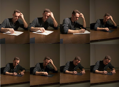


 So, back to sketching. Sometimes, illustrations only require one or two drawings. Not this illustration. The collection of drawings below is about half of what I did trying to work out this Halloween concept.

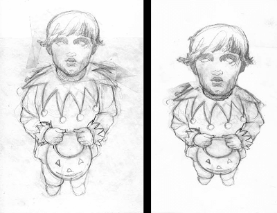 Thanks to Photoshop, I was able to distort my sketch to achieve a more dramatic view of the Trick r Treating boy.
 Unfortunately, I have only one photo of the oil painting in progress. In my typical process, I began to paint the objects in the back ground first. I gave extra efforts to paint the heads in the back ground as well as I could in one sitting (8hrs) knowing I was probably not going to have time to go over them with a second, more refined coat of paint. To accelerated the drying process of the wet oil paint, I placed the painting inside of my car for a couple of hours during a hot, sunny day.
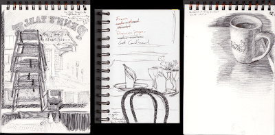 Left: A local restaurant in West Chester, PA called Penn's Table. A stack of highchairs and a view outside.



 The doors were created with a subtle play of the Antonelli Logo. Using Athena the goddess of creativity, Antonelli Institute (established in 1938) designed a Art Deco inspired representation of the goddess.
 A mural of the Philadelphia Art Museum with the Sculpture of Rocky Balboa painted on the rock climbing wall.
 Mural honoring Penn's landing and Independence Hall
 Mural of Boat House Row
 We were very fortunate to have a tent to work under while we painted the smaller murals which were then placed along the fence.
 The mural of the Art Museum, on the other hand, was painted without safe cover. I am so amazed and grateful for everyone who came out and volunteered to paint in the 90+ degree heat and sun and humidity.
 Credits for everyone who helped me paint the mural. Not everyone is represented in these photos.
 This is the color study I did for the Penn's Landing/Independence Hall mural. First sketched in Pencil on Tracing paper, scanned, then colored in Photoshop CS4. The squares above and below are all of the colors needed to paint the mural. I used codes to indicate matching colors for different sections of the mural.
  The photo above is the color swatch page used to mix and match the donated paint for the mural of the Penn's Landing/Independence Hall Mural. I spent most of the first two days mixing the colors from the dozens of random used exterior paints. 95% of the used paint was unusable. But, I managed to mix most of the colors necessary for the mural. Still, some colors I wanted I did not want to compromise quality in vibrancy and tone and was grateful for the friends and colleagues who donated to the Freedom Playground Custom Paint fundraiser I coordinated.
To: Jennifer Davis, Roger and Judy Scull, Lisa Deaton and Leslie Gearhart, Ed Zawora, and Andrew Simcox, thank you for your generous donations.
 Right: title: Slave to the Show
 Click on photos for larger view
More information on the shows:
www.bravenewworlkscomics.com/2010/05/robot-friday-domo-arigato/5710/
www.exitphiladelphia.com/post/deck-head-3/
 Who (or what?) is the Ringleader commanding?
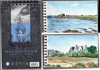
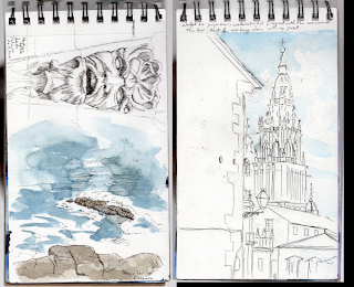 The page to the left was done at the bottom of a very high cliff in Galicia, Spain. This coastline is called the End of the Earth. My favorite story on how this location received it's name is the fact that it is the furthest west of the European continent. Therefore, during the time when the public considered the earth flat, they assumed that they could see...The end of the Earth at the horizon. Furthermore, they believed that when the ships would sail beyond the horizon, the ships would fall of the earth and perish.
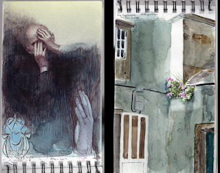 The page on the left was one of the first drawings I did in the sketch book. This page sure is dark and somber. I still recall how burnt out and exhausted I was when I began my vacation in France/Spain.
I know that I am going to devote at least 15 to 20 hours of time just to do a painting. Therefore, I don't want to gamble with the possibility that the painting may or may not turn out well because I didn't devote 2 two 3 hours gathering reference and experimenting with the sketch paper and pencil with layout, composition, lighting and emotional impact.
Below, on the left, is my page of photos I gathered from magazines and the internet to help guide me into drawing convincing hair in the wind. To the right is my second attempt to design the hair blowing in the wind.

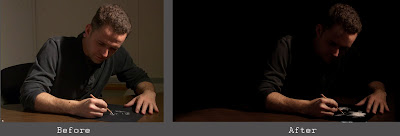
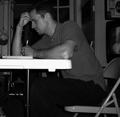 er lighting I prefer. After spending a very frustrating hour trying to guess how to "dramatize" the lighting upon my face, I abandoned the drawing and the photograph.