Showing posts with label photoshop. Show all posts

Saturday, March 23, 2013

Metamorphosis

2 pages of thumbnail sketches
Finish sketch and tonal study
Unused Lead pencil drawing and digital coloring
Left image: A color experiment
Right image: The actual digital layer of the 
coloring of the dragonfly below
Finished art
Left image: The original white pencil on black paper drawing
Right image: My new business card
   
My new business card, when folded, is the size of the standard business card.
But, also hints at flapping of wings when opened and closed.


Tuesday, February 19, 2013

Floating Near Optimism


White Chalk on Black Paper


Color Version (Photoshop)


Sunday, March 6, 2011

Lots and Lots of Obama Portraits


I created this portrait of Barack Obama to help me teach
a lesson on Creating Vector Portraits.
(Vector- a computer generated graphic art that can be enlarged or reduced to any size
without losing clarity.)

As with any good illustration, especially when creating vector illustrations, a sketch is required to plan out the shapes of the dark and medium tone. I scan in the sketches and begin to trace the shapes in Illustrator. After a few refinements to the shapes, I can begin to experiment with color and textures. The greatest advantage to computer generated art is how easy it is to make color changes as well as the easy ability to save multiple variations of the same drawing. It gets to be addictive trying to come up with better and better color designs!

While I didn't intend to mimic Shepard Fairey's famous portrait of Barack Obama, it's hard not to see his influential style within my rendition of Obama. His designs, used with silkscreen and stencils with spray paint, works very well with using the vector illustration technique. I always advise students to look at as much good art as possible and try to replicate the look in order to build one's creative skills -- watching out of course for blatant plagiarism!

Sunday, March 7, 2010

New Header!

I finally managed to update the header of this journal. After all, the top of an artist's journal should have something representative of one's creative lifestyle. The execution of the header went through a couple of changes before it evolved to a retouched photograph. First, I began a drawing with a white pencil on black paper. But, I was working with reference that did not have the proper lighting I prefer. After spending a very frustrating hour trying to guess how to "dramatize" the lighting upon my face, I abandoned the drawing and the photograph.

Fortunately, my friend and master photographer, Robert (Bob) Golding offered to help me with my lack of reference information. His appreciation for detail and lighting made me confident that he would successfully direct me into an expressive pose. After I showed him my failed first attempt for the header, we got to work.
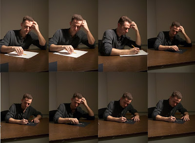


With one, very bright, spot lamp, a tripod, camera and a few experimental poses, Bob captured several usable shots
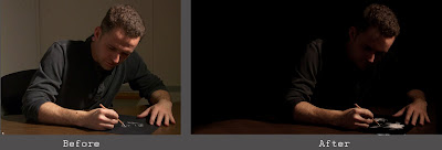


My original intent was to paint a self portrait with oil paint. After all, I am a painter more so than a photo-retoucher. But, after a few hours of adjusting, some retouching, adjusting some more, then a little more retouching, I was very pleased with the results.
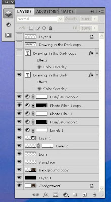


Here are the multiple layers I used in Photoshop CS4 to achieve the header created. My favorite layer is the layer named "Stampface." On that layer, with the amazing "Stamp tool," I managed to soften my caveman eyebrow.


Thank you Stamp Tool!