Showing posts with label photo reference. Show all posts

Thursday, June 13, 2013

Progress Shot Part 2 - Refine the Drawing and Begin Adding the Detail

The painting is going through several subtle changes as I continue to study the flowers and it's leaves. One can see the unique evolution, specifically the wing-like thingees, the bleeding heart flowers (the pink flowers) goes though as they blossom.

Click on photo to enlarge.
A lot of calculation were made to create a properly scaled digital tablet. I am surprised how close to square it is.

Click on the photo to enlarge.
.
To my good fortune, I have a few bleeding heart flowers growing in my yard. I plucked and studied a stem of leaves and discovered how poorly I interpreted my photo reference. I don't have access to any poppy flowers, but I can tell you that I discovered big differences in leaf type between the different poppy species. 

Sunday, March 14, 2010

In Progress...Part 2

I managed to squeeze in a day of painting during this busy week.


I know that I am going to devote at least 15 to 20 hours of time just to do a painting. Therefore, I don't want to gamble with the possibility that the painting may or may not turn out well because I didn't devote 2 two 3 hours gathering reference and experimenting with the sketch paper and pencil with layout, composition, lighting and emotional impact.

Below, on the left, is my page of photos I gathered from magazines and the internet to help guide me into drawing convincing hair in the wind. To the right is my second attempt to design the hair blowing in the wind.

Sunday, March 7, 2010

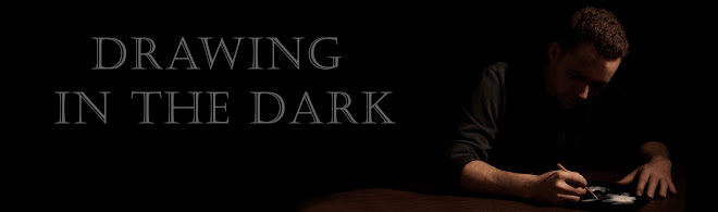
New Header!

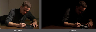
I finally managed to update the header of this journal. After all, the top of an artist's journal should have something representative of one's creative lifestyle. The execution of the header went through a couple of changes before it evolved to a retouched photograph. First, I began a drawing with a white pencil on black paper. But, I was working with reference that did not have the proper lighting I prefer. After spending a very frustrating hour trying to guess how to "dramatize" the lighting upon my face, I abandoned the drawing and the photograph.

Fortunately, my friend and master photographer, Robert (Bob) Golding offered to help me with my lack of reference information. His appreciation for detail and lighting made me confident that he would successfully direct me into an expressive pose. After I showed him my failed first attempt for the header, we got to work.


With one, very bright, spot lamp, a tripod, camera and a few experimental poses, Bob captured several usable shots


My original intent was to paint a self portrait with oil paint. After all, I am a painter more so than a photo-retoucher. But, after a few hours of adjusting, some retouching, adjusting some more, then a little more retouching, I was very pleased with the results.


Here are the multiple layers I used in Photoshop CS4 to achieve the header created. My favorite layer is the layer named "Stampface." On that layer, with the amazing "Stamp tool," I managed to soften my caveman eyebrow.


Thank you Stamp Tool!

Saturday, January 16, 2010

Work With What You Have

I was confronted with a challenge this week: To draw a portrait of a friend, Chris Patchell (aka. Patch) without an ideal reference. Conflicting schedules prevented a photo session that would have provided me controlled lighting. I prefer this dramatic lighting that would fall upon his face, but without the session, I did not have this key information. But, I utlized my experience of the many portraits I have drawn and painted over the years to persevere. I selectively edited out parts of his face and carefully moved the highlights observed in the photo reference. I was very pleased with this portrait, and it will soon be published in a book from the Philadelphia Cartoonist Society.